


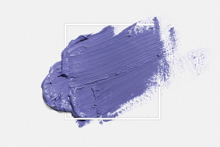
Described by Pantone as “a new color whose courageous presence encourages personal inventiveness and creativity,” Very Peri is a warm periwinkle blue with a violet-red undertone – the “happiest and warmest of all the blue hues.”
 This is the first new shade that the Pantone Color Institute has invented from scratch in it’s 22-year history. Their description continues, “With trends in gaming, the expanding popularity of the metaverse, and rising artistic community in the digital space, Very Peri illustrates the fusion of modern life and how color trends in the digital world are being manifested in the physical world and vice versa.”
PCI Executive Director Leatrice Eiseman offers her view of the 2022 choice for Color of the Year: “As we move into a world of unprecedented change, the selection of PANTONE 17-3938 Very Peri brings a novel perspective and vision of the trusted and beloved blue color family, encompassing the qualities of the blues, yet at the same time with its violet-red undertone, it displays a spritely, joyous attitude and dynamic presence that encourages courageous creativity and imaginative expressions.”

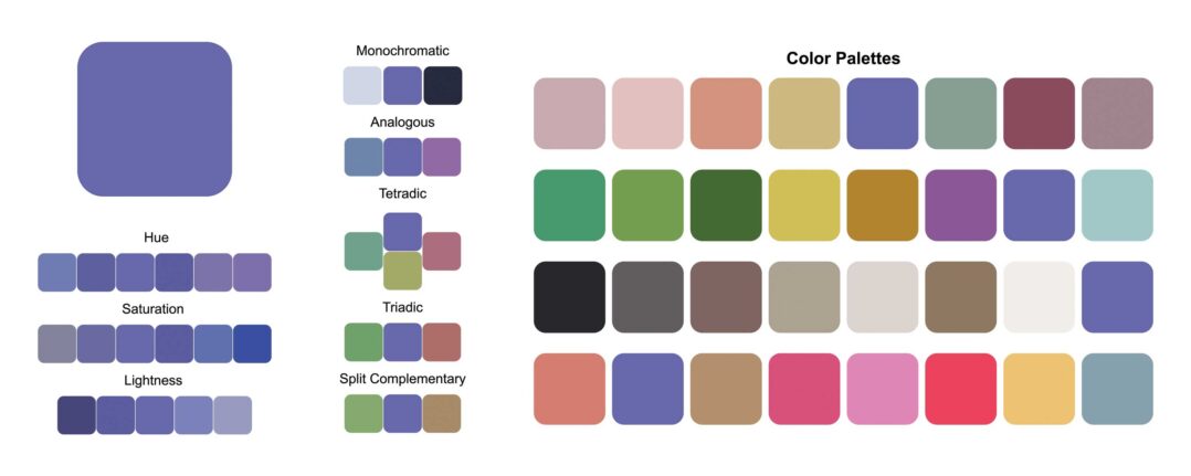
The happiest and warmest of all the blue hues, Very Peri pairs perfectly with a palette of classics and neutrals such as black, oak and sand shades, as well as white, pink, beige, green.
Adds PCI Vice President Laurie Pressman, “Creating a new color for the first time reflects the global innovation and transformation taking place. As society continues to recognize color as a critical form of communication, and a way to express and affect ideas and emotions and engage and connect, the complexity of this new red-violet-infused blue hue highlights the expansive possibilities that lay before us.”


Designers are using the color to dress up a wall to create a bold backdrop, brighten an otherwise neutral space; be an element of surprise when color is least expected.“For those who are gun-shy about using too much color and taking that first step, it’s a great color to use, maybe just on one wall instead of all four walls,” notes Eiseman. “Perhaps in an entry area, in a hallway where you’re leading from one space to the other and you want to add some extra excitement to it and you don’t want the same old taupe gray, you can add a little more oomph to the area.”
")
")
")
")
")
")
")
")
So Many Options:
- Use it as a wall accent color in a bedroom or office. You’ll be inspired from the moment you wake up or sit down to work.
- Bring in peeks of the color in decor like a patterned rug, pillows, an upholstered chair or artwork.
- Combine it with natural colors and elements – like natural material rugs or light wood accents – to play off its calming qualities.
- Make a statement with a glossy finish.
- Hunt for periwinkle fabrics, rugs and wall coverings.
- Try Veri Peri in a kid’s room.
anastasiia agafonova / stock.adobe.com Zaitseva / stock.adobe.com zatevakhin / stock.adobe.com