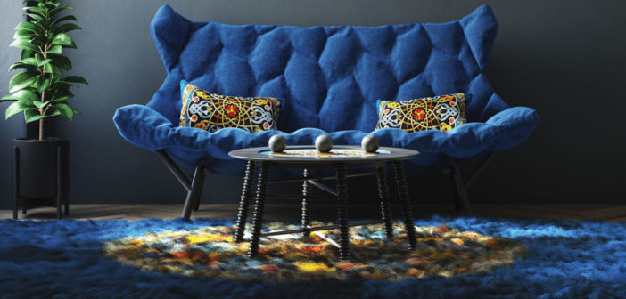
Boundless
Cerebral
Soothing
Serious
Straightforward
For over 20 years, the PANTONE Color of the Year has influenced product development and purchasing decisions in multiple industries, including fashion, home furnishings and industrial design, as well as product packaging and graphic design.
This year’s choice, Classic Blue, is reminiscent of the sky at dusk. “It’s a color that anticipates what’s going to happen next,” comments Laurie Pressman, Vice President of the PANTONE Color Institute™, which selects the Color of the Year.
According to pantone.com, selecting the PANTONE Color of the Year requires thoughtful consideration and trend analysis. To arrive at the annual selection, color experts at the PANTONE Color Institute comb the world looking for new color influences. This can include the entertainment industry and films in production, traveling art collections and new artists, fashion, all areas of design, popular travel destinations, as well as new lifestyles, playstyles and socio-economic conditions. Influences may also stem from new technologies, materials, textures and effects that impact color, relevant social media platforms and even upcoming sporting events that capture worldwide attention.
PANTONE Color Institute Executive Director, Leatrice Eiseman, is a fan of the 2020 choice. “We are living in a time that requires trust and faith. It is this kind of constancy and confidence that is expressed by PANTONE 19-4052 Classic Blue, a solid and dependable blue hue we can always rely on,” she states. “Imbued with a deep resonance, Classic Blue provides an anchoring foundation. A boundless blue evocative of the vast and infinite evening sky, Classic Blue encourages us to look beyond the obvious to expand our thinking; challenging us to think more deeply, increase our perspective and open the flow of communication.”
Designers Weigh In
What is the best way to use this color? Large spaces? Small spaces? As an accent?
“Classic Blue has the same sort of tonalities as the sky, so I would use it in a room with big windows so the sky can be part of the color palette. But then, I would add some warm colors to cozy it up, in the same way a sunset warms up the sky.”
– Karen Robert (NY)
“This color can be used anywhere, large and small or as an accent. Painted walls, millwork, tiles, fabrics or pillows and artwork. Plays well with others!”
– Katie Wozniak of Katherine Elizabeth Designs (IL)
What tone does Classic Blue convey in your professional opinion?
“Ahhh, Classic Blue is so divine and serene … it’s cerebral. It makes you feel safe, it makes you feel calm. It’s strong and soothing all at the same time, and of course, tried and true.”
– Toledo Geller (NJ)
“Classic Blue is a rich color that feels luxe, familiar and playful at the same time.”
– Katharine Earnhardt of Mason Lane Art Advisory Services (NY)
In what room in the home does Classic Blue make the most sense and why?
“I love the color for a kid’s room, where vibrancy and boldness are needed for development.”
– Tina Ramchandani (NY)
“A guestroom. It’s a playful yet mature color that would make a memorable impression for guests.”
– Gabriela Gargano (NY)
What other style trends to you expect to see in the 2020s?
“One of the themes we hear over and over is the connection between the living environment and our health. Creating healthy spaces, rooms that nurture and restore our sense of well-being is a trend that is only going to grow in this next decade. Thinking about sustainable design, the impact of color on our mood and using natural materials combined with developments in performance furnishings are worth watching.”
– Joni Vanderslice, J. Banks Design Group (SC)


