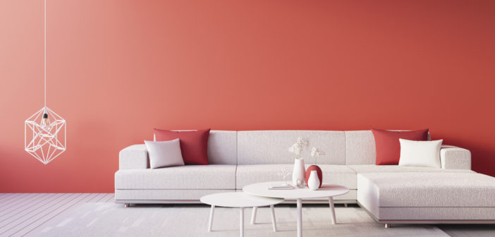
The vibrant color chosen by the PANTONE Color Institute is described as “an animating and life-affirming coral hue with a golden undertone that energizes and enlivens with a softer edge.”
According to pantone.com: the PANTONE Color of the Year influences product development and purchasing decisions in multiple industries, including fashion, home furnishings and industrial design, as well as product, packaging and graphic design. Now in its 20th year, the selection process requires thoughtful consideration and trend analysis. To arrive at the selection each year, PANTONE’s color experts comb the world looking for new color influences. Vibrant, yet mellow Living Coral embraces us with warmth and nourishment to provide comfort and buoyancy in our continually shifting environment.
“Color is an equalizing lens through which we experience our natural and digital realities and this is particularly true for Living Coral,” states Leatrice Eiseman, Executive Director of the PANTONE Institute. “With consumers craving human connection and social interaction, the humanizing and heartening qualities displayed by the convivial PANTONE Living Coral hit a responsive chord.”
Effervescent • Energizing • Lighthearted • Vivid
Mixed Reviews from The Design Industry
Many interior designers await the challenge of integrating the Color of the Year into their palettes. Some are opting to use the color in outdoor settings, such as seat cushions for an outdoor dining set. Others will be using it to create a spark of interest in a monochromatic scheme.
“I prefer a more toned-down version of coral for interiors – either pale corals or rich, deeper corals – especially pretty paired with blues or chartreuse.”
Erin Gates – Designer and Author of Elements of Style
“It might not be something that I am ready to paint on my walls, but I could get very into using a few small hits of the color peppered around a room to give it a little bit of a punch.”
Emily Henderson – Designer, Author & Stylist
“I’m loving Living Coral. Much like burnt orange, which I predicted for Etsy’s color of the year, this refreshing tone embodies authenticity and draws inspiration from nature.”
Dayna Isom Johnson – Resident Trend Expert, Etsy
Etsy is an e-commerce website focused on handmade or vintage items and supplies, as well as unique factory-manufactured items.
“Living Coral is fun and vibrant … I imagine doing a room in this color would result is a supremely happy space … bright in the morning sun, yet cozy and warm in the evenings!”
Alison Pickart – Interior designer
About the PANTONE® Color Institute
The PANTONE Color Institute is the business unit within PANTONE that highlights top seasonal runway colors, forecasts global color trends, and advises companies on color for product and brand visual identity. Through seasonal trend forecasts, color psychology, and color consulting, the Color Institute partners with global brands to leverage the power, psychology, and emotion of color in their design strategy.
The Pantone Color Institute has declared a Color of the Year every year since 2000. As they go to pains to point out, it is a trend observation rather than a forecast, though its announcement does have an impact in the realms of décor and design.
Source: Pantone.com


